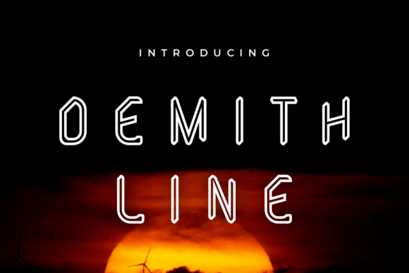
Demith Line: A Distinctive Display Font for Digital Design
As a web designer who ships landing pages, SaaS dashboards, and e-commerce experiences daily, I pay close attention to how typography shapes perception before the first word is read. Demith Line stands out—not as background noise, but as intentional presence. It’s a display font with clean geometry, subtle angularity, and confident spacing. Think of it as a modern typographic accent: not overly ornate, not minimalist to the point of anonymity—just quietly assertive.
In practice, Demith Line excels where visual hierarchy meets brand tone. Its uppercase-heavy character set and balanced letterforms make it ideal for hero section headlines, product name treatments, and CTA buttons that need to stand apart without shouting. On a responsive layout, it scales cleanly from desktop to tablet—its open counters and consistent stroke weight maintain legibility even at 48px on mobile viewports. That said, avoid using it for body copy or long navigation labels; it’s designed for impact, not endurance.
Where Demith Line Delivers Real Web Value
Unlike generic display fonts that blur into the background, Demith Line carries personality you can align with voice and values. A boutique skincare brand might use it for “Pure Radiance” in a hero banner—clean, elevated, trustworthy. A design studio launching a new portfolio site could apply it to project titles overlaid on full-bleed imagery, letting the font’s confident rhythm anchor the composition. For a course sales page, pairing Demith Line with a neutral sans serif (like Inter or Manrope) creates immediate contrast: one conveys authority and distinction, the other ensures effortless scanning and comprehension.
- Landing pages: Use for primary headline and subheadline only—never paragraph text. Test contrast against gradient or image backgrounds; its medium-weight variants hold up well on light and dark modes when paired with sufficient padding.
- Online stores: Apply to category banners (“New Arrivals”, “Limited Edition”) or flash sale tags. Avoid small-size usage on product cards—reserve it for large-format promotional zones.
- Digital ads & social graphics: Works exceptionally well in static and animated banners up to 720px wide. Its strong x-height and tight kerning prevent visual drift at smaller sizes.
- Branded UI elements: Consider for modal headers, empty-state illustrations (“No items yet”), or milestone badges (“Launched Q3”). Not for form labels or inline help text.
Readability, Responsiveness, and Real-World Constraints
On mobile, Demith Line remains highly legible down to 36px—but only when line height is set to at least 1.3 and letter-spacing is adjusted to +0.5px for tighter rhythm. Never force it below 28px, especially over textured or busy backgrounds. When used on dark mode interfaces, opt for the lighter weight variant with a subtle text-shadow (1px white, 20% opacity) to lift it off the background without sacrificing elegance.
For image overlays, test contrast ratios rigorously. While Demith Line has excellent optical balance, its uniform stroke weight means it relies more on color contrast than structural variation. Always verify AA compliance using browser dev tools—especially if your site serves global audiences or accessibility-conscious users.
Smart Pairing for Consistent Digital Identity
A display font like Demith Line thrives when anchored by functional companions. My go-to pairings:
- Sans serif body fonts: Inter, Poppins, or IBM Plex Sans provide neutrality and readability while letting Demith Line shine in headings. Ideal for SaaS dashboards, blog posts, and documentation sites.
- Geometric serifs: For editorial or premium brand contexts (think newsletters, digital magazines, or creative agency sites), try pairing with Literata or Crimson Text—adds gravitas without competing visually.
- Avoid script or handwritten fonts unless intentionally juxtaposing moods (e.g., playful brand storytelling). Demith Line’s precision doesn’t harmonize with organic flow—it’s better served by clarity, not contrast-for-contrast’s-sake.
Check the font package before licensing: ensure it includes WOFF2 files for optimal web delivery, at least two weights (Regular and Bold), and basic Latin-1 support. If your audience includes Spanish, French, or German speakers, confirm accented characters are included—not all display fonts handle diacritics gracefully.
Licensing, Deployment, and Long-Term Use
As a commercial font, Demith Line requires proper licensing for live websites, client projects, digital templates, and branded assets. Most reputable foundries offer tiered plans—choose one that covers domain-based usage, not just single-site installs. If you’re building reusable Figma kits or Shopify themes for resale, verify extended licenses cover redistribution.
When deploying via CSS, load Demith Line asynchronously and define fallbacks (font-display: swap) to prevent invisible text during load. Combine it with system-ui fallbacks for graceful degradation—this preserves hierarchy even if the font fails to render.
Finally, remember that Demith Line isn’t about decoration. It’s about intentionality: choosing a display font that reflects confidence without compromise, supports scanning behavior without sacrificing elegance, and reinforces brand identity across every pixel it touches. Whether you’re refining a checkout flow, launching a micro-SaaS, or crafting a founder’s personal site—Demith Line gives your typography a distinct signature, not just another layer of styling.