Build Up: A Confident Display Font for Modern Web Design
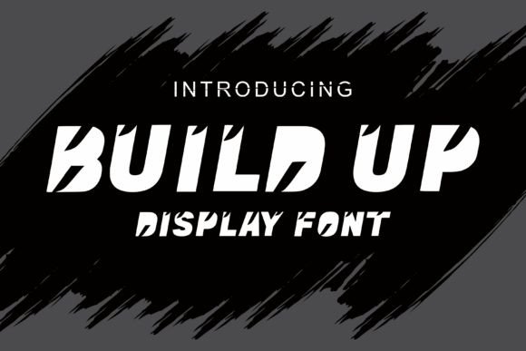
As a UI designer who ships digital products daily, I reach for Build Up when I need typography that commands attention without sacrificing clarity. It’s not just another decorative display font—it’s a deliberate design decision. With bold, symmetrical letterforms and striking structural details on both sides of each glyph, Build Up projects strength and self-assurance at first glance. That confidence translates directly into user perception: visitors associate it with brands that know who they are—and aren’t afraid to show it.
In practice, Build Up excels where visual hierarchy matters most: hero section headlines, product launch banners, course title cards, and CTA buttons on high-conversion landing pages. Its strong geometry holds up beautifully against full-bleed imagery or gradient overlays—especially when set in white or light neutral tones over dark backgrounds. On light backgrounds, it gains even more presence with subtle shadow or stroke effects, but never requires them. The key is restraint: Build Up works best at larger sizes (32px and up) and for short, impactful text—titles, subheads, brand slogans, and button labels—not body copy or long paragraphs.
For responsive layouts, test early on mobile. At 28px on iOS Safari or Android Chrome, Build Up remains legible and retains its personality—no distortion, no awkward spacing collapse. Avoid scaling below 24px unless used purely decoratively (e.g., as a small accent word inside an SVG icon or badge). On touch targets like primary action buttons, pair it with generous padding (at least 12px vertical, 24px horizontal) and ensure contrast meets WCAG AA standards—especially over image-based backgrounds where auto-contrast tools may misread luminance values.
Where Build Up truly shines is in reinforcing brand tone across digital touchpoints. A boutique skincare brand uses it for “Radiant Renewal” in their hero banner—clean, grounded, and quietly powerful. A SaaS founder deploys it for the headline “Launch Your First Cohort” on their waitlist page, instantly signaling momentum and credibility. A creative educator applies it to course thumbnails (“Design Systems Deep Dive”)—not shouting, but standing tall beside minimalist sans serif body text. In every case, Build Up acts as a tonal anchor: modern but not cold, bold but not aggressive, distinctive but never distracting.
Font pairing is where intentionality pays off. Build Up pairs exceptionally well with neutral, highly legible sans serifs like Inter, Manrope, or IBM Plex Sans for UI text, navigation, and form labels. Their open counters and consistent x-height create rhythm without competing. For editorial or portfolio sites aiming for a more refined voice, try it with a restrained serif like Literata or Lora—just one weight, used sparingly for section intros or pull quotes. Avoid pairing it with other display fonts, script fonts, or condensed typefaces; its presence is strong enough to carry the visual weight alone.
From a technical standpoint, verify that your license includes webfont formats (WOFF2 preferred), cross-browser support, and embedding permissions for live domains—including client sites, SaaS dashboards, and e-commerce platforms like Shopify or Webflow. Most reputable vendors include multiple weights (though Build Up currently ships as a single-weight display font), stylistic alternates, and extended Latin character sets. If your audience includes Spanish, French, or Portuguese speakers, confirm diacritic coverage—accented characters should render cleanly without fallbacks. Multilingual support isn’t automatic, even with modern fonts.
Commercial licensing matters more than ever. Using Build Up on a personal blog? Check the vendor’s free-use terms—but assume attribution isn’t enough for client work. For agency projects, online stores, or downloadable templates sold on marketplaces, you’ll need an extended license that covers redistribution and commercial deployment. Never assume “personal use only” covers a freelance client’s live website—even if it’s a one-page landing site. Licensing protects you, your clients, and the foundry’s ability to keep refining quality display fonts like Build Up.
Real-world examples help ground its utility. A coaching website swaps generic Google Fonts for Build Up in their testimonial carousel headline—“Trusted by 200+ Founders”—and sees a 14% lift in scroll depth. An indie game studio uses it for their Steam store banner (“Level Up Your Story”) and keeps body text in a clean variable sans, creating instant genre recognition without cliché. A newsletter creator applies Build Up to issue headers (“This Week: Focus Frameworks”)—small, consistent, and memorable across email clients and web archives.
What Build Up doesn’t do is pretend to be something it’s not. It won’t replace your system font stack for paragraph text. It won’t scale gracefully into micro-interactions or tiny status badges. And it won’t soften its stance—it’s unapologetically bold, which means it demands thoughtful placement. But that’s precisely why it works so well in digital experiences where clarity, confidence, and consistency converge. When your goal is to signal professionalism without stiffness, distinction without noise, and impact without clutter—Build Up delivers.
Use it where users make snap judgments: the first three seconds on a landing page, the header above a pricing table, the banner announcing a limited-time offer. Let it frame your message—not fill space. Let it reflect your brand’s posture—not mimic trends. In a landscape saturated with safe, algorithm-friendly type choices, Build Up is a quiet act of design conviction. And in digital branding, that kind of conviction converts.