Sqoely: A Futuristic Display Font for Digital Branding
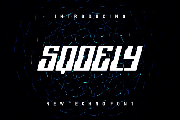
As a UI designer who ships landing pages, SaaS dashboards, and e-commerce experiences weekly, I pay close attention to how typefaces shape perception before a single word is read. Sqoely stands out—not because it’s loud or ornate, but because it carries a quiet, confident futurism that reads as intentional, not experimental. It’s a display font built for digital clarity: clean geometry with subtle asymmetry, open counters, and balanced spacing that holds up across screen sizes and contexts.
Sqoely isn’t meant for paragraphs or body copy—and that’s by design. Its strength lies in commanding attention where it matters most: hero section headlines, product name treatments, CTA buttons with personality, and logo lockups that need to feel both current and timeless. On a coaching website’s headline—“Clarity Starts Here”—Sqoely adds weight without heaviness. On a boutique online store banner—“Handcrafted. Limited Edition.”—it signals exclusivity through form, not flourish.
Where Sqoely Earns Its Place in Your Layout
In real-world web projects, Sqoely performs best when used sparingly and deliberately. Think of it as your brand’s visual signature—not its voice, but its tone. It excels in:
- Hero titles and subheads—especially over high-contrast backgrounds or subtle image overlays. Its even stroke weight and generous x-height ensure legibility at large sizes on desktop and mobile alike.
- Logo text and monogram treatments—where uniqueness and memorability matter more than versatility. Sqoely’s letterforms have enough character to stand alone, yet avoid the fragility of script or handwritten fonts.
- Section dividers and decorative accents—like “Testimonials” or “Features” labels in a product landing page. A single line in Sqoely creates rhythm and reinforces brand cohesion without competing with content.
- Digital ads and social banners—where fast scanning is non-negotiable. Its distinct silhouette registers in under two seconds, helping your message cut through feed noise.
It’s less effective—and not intended—for navigation menus, form labels, or small-button text below 18px. That’s not a limitation; it’s alignment with its purpose as a display font. Respect its role, and it strengthens hierarchy instead of undermining it.
Readability Across Devices and Contexts
I’ve tested Sqoely across iOS, Android, and responsive breakpoints—and it scales cleanly. At 48px on desktop, its open apertures and consistent proportions maintain crispness. At 32px on tablet, it retains presence without crowding. Even at 28px on mobile portrait, it remains scannable when paired with appropriate line height (1.2–1.3) and letter-spacing (+0.5px for tighter control).
On dark mode interfaces, Sqoely benefits from a subtle text shadow (1px blur, same color as background) to lift it off deep backgrounds. Over light imagery, a soft white or near-white fill with 90% opacity preserves contrast while avoiding harsh halos. Avoid thin weights or ultra-light variants for web use unless you’re certain of your audience’s rendering environment—stick to the standard or bold weight for maximum reliability.
Smart Pairing for Web Design Systems
No display font lives in isolation. Sqoely pairs exceptionally well with neutral, highly legible sans serifs like Inter, Manrope, or IBM Plex Sans for body copy, captions, and interface text. The contrast between Sqoely’s expressive structure and a functional workhorse font creates breathing room and directs attention exactly where you want it.
For editorial or premium brand sites—think course platforms or creative agencies—try pairing Sqoely with a restrained serif like Cormorant Garamond or Literata. The combination signals sophistication without sacrificing digital readability. Just keep serif usage to headings and pull quotes; let Sqoely anchor the top of the visual stack.
Licensing, Formats, and Practical Integration
Sqoely ships as a web-optimized font family with WOFF2 support, variable font options (where available), and full Unicode coverage for major Western European languages. If your project targets multilingual audiences, confirm whether extended Latin or Cyrillic glyphs are included—many modern display fonts cover basic needs but stop short of full global support.
Licensing is straightforward: a commercial license covers use on live websites, client-facing SaaS dashboards, Shopify themes, email templates, and digital ad assets. You’ll need an extended license only if embedding Sqoely into downloadable design kits, editable Figma templates sold publicly, or white-labeled software where end users can export or modify typography.
Importing into CSS is simple—host locally or via a trusted CDN. Always declare fallbacks (e.g., font-family: "Sqoely", -apple-system, BlinkMacSystemFont, "Segoe UI", sans-serif;) and test loading behavior. Consider using font-display: swap to avoid invisible text during load, especially on performance-sensitive landing pages.
Final Note on Intentional Typography
Sqoely doesn’t solve every typographic challenge—but it solves a specific one exceptionally well: giving digital brands a distinctive, future-forward identity that feels grounded, not gimmicky. When your goal is to signal innovation without alienating users, or to elevate a premium offering without resorting to cliché luxury cues, Sqoely delivers clarity, confidence, and consistency.
Use it where your brand needs to be seen first—not read fastest. Let your body copy do the explaining. Let Sqoely do the introducing.